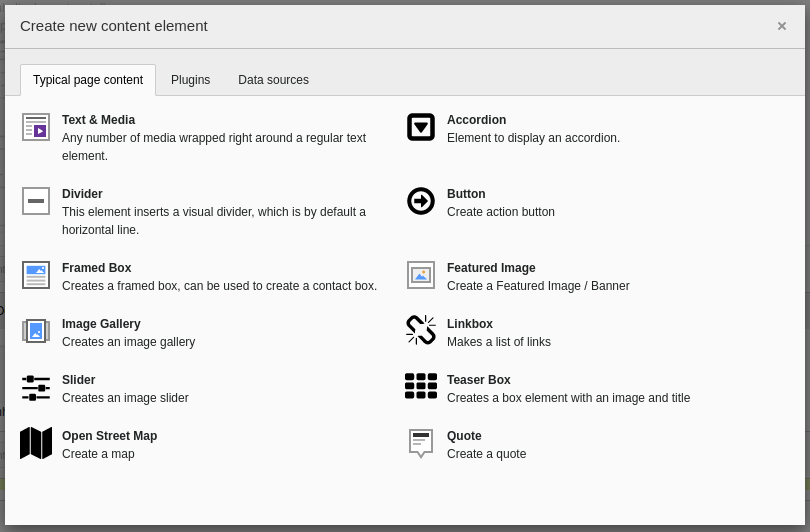
Typical content elements
In the following all content elements are listed, which are available when you click on the [+ Content] button.
All content elements are listed in their default configuration. Almost no settings have been made, mostly only those which are mandatory for a display.
Recommendations about layout and text design, combination of content and grid elements, image formats etc. can be found in the easyWeb styleguide:https://easyweb-styleguide.unibas.ch/en/.
The sample pages suggested in the style guide can also be found in the "Templates" folder in your page tree. From there, you can copy the sample pages and then use and modify them in your instance using copy-and-paste.
When embedding images, make sure that the images are not too large. Otherwise the website will load worse.
Text & Media

In the Text & Media element you can place headlines, continuous text and images. A richtext editor (like in a word processing program) is available for this purpose. A special element in the editor are the tables. The exact function is explained in several video tutorials:
- The "Text & Media" content element
- Creating and editing texts with the Rich Text Editor (RTE)
- Tables in the Rich Text Editor
You can also find a detailed instruction here.
Table (in Text & Media)
| # | FIRST NAME | LAST NAME | USERNAME |
|---|---|---|---|
| 1 | Mark | Otto | @mdo |
| 2 | Jacob | Thornton | @fat |
| 3 | Larry | the Bird |
Attention: If you paste tables from an external program (like Microsoft Word or Excel) with Ctrl+V, a lot of unnecessary (and invisible) information will be included, which will make the page with the table look very sluggish. Therefore you should always use the "Remove Format" function after inserting. To do this, select the entire table with the mouse and then click on the "Remove Format" button at the top of the RTE (to the right of the brush icon). In general, it should be avoided to display a large amount of information on a page with the help of tables - for this purpose, other tools and functions that easyWeb provides should be used.
Accordion
An accordion is used to systematically separate content from one another and to display only part of the content at a time (content condensation). The different elements of an accordion can be expanded and collapsed independently of each other. The color scheme changes automatically between gray and white. All other content elements can be inserted into an accordion.
A detailed guide to accordions with the special features of easyWeb Standard can be found here:
Lorem ipsum dolor sit amet, consetetur sadipscing elitr, sed diam nonumy eirmod tempor invidunt ut labore et dolore magna aliquyam erat, sed diam voluptua. At vero eos et accusam et justo duo dolores et ea rebum. Stet clita kasd gubergren, no sea takimata sanctus est Lorem ipsum dolor sit amet. Lorem ipsum dolor sit amet, consetetur sadipscing elitr, sed diam nonumy eirmod tempor invidunt ut labore et dolore magna aliquyam erat, sed diam voluptua. At vero eos et accusam et justo duo dolores et ea rebum. Stet clita kasd gubergren, no sea takimata sanctus est Lorem ipsum dolor sit amet.
A quote.... "The English language is confusing. It can be understood through tough thorough thought though."
Unknown
Divider
You can use the Divider element to separate content elements on a page from each other. The style of the line is predefined and cannot be changed. Learn more in the video tutorial:
Button
With the button a button (style is given, except width) can be inserted in the page, which calls the deposited URL when clicked.
Framed box
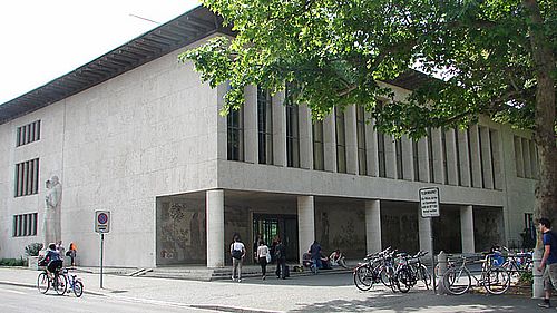
The Framed Box is a flexibly designable content element, which often contains address data or contacts and displays them clearly. It also has two interactive fields for a website and email address. As shown here in the example, you can also add a teaser image showing for example your faculty and premises or a map (OpenStreetMap). Please finde further instructions here.
Universität Basel
Example Adress Title
Example Contact Section
Musterstrasse 7
4001 Musterhausen
Schweiz
Tel: +41 61 123 45 67
Fax: +41 61 987 65 43
Featured Image
The Featured Image is an element that displays a single image across the entire available width of the grid element. If there is a description to the image, it will be displayed large at the bottom of the element. You find the instruction here.

Universität Basel
Image Gallery
An Image Gallery contains multiple images and is displayed across the entire width of a grid element. Below the displayed image, a preview with all elements in this Image Gallery is shown. When you click on a preview, the selected element is displayed in large size. Please find more detailed information here.


Linkbox
Links to internal or external content can be listed in the link box. The style is fixed by the corporate design.
Slider
The Slider element works similarly to the Image Gallery, namely it also contains multiple images that are displayed on full grid width. However, the slider automatically switches between the different images and there is no preview.

Universität Basel

Teaser Box
The teaser box is a stylized element that contains an image, a title and a text paragraph. When you click on any area in the teaser box, you will be redirected to the stored URL.
Open Street Map
The Open Street Map element allows you to place an interactive map (zoom and move) on your page. To do this, you need to know the longitude and latitude for the location on which you want to initially center the map. Height and width of the element are adjustable.
Quote
With the Quote element, a quote can be inserted on the page. The font is automatically adjusted and the author is placed right below.
The meaning of life is not to be a successful person, but a valuable one.
Albert Einstein