The content element "Accordion
With the accordion you can display information easily and clearly. The content is not displayed by default. When you click on it, a single part opens - it is closed in the same way. Thus, not all information is displayed at once and information overflow is prevented.
Clear and practical - if you give meaningful titles.
Content
Instructions as an example of an accordion

Create an accordion in the backend
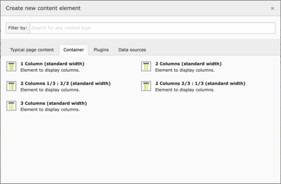
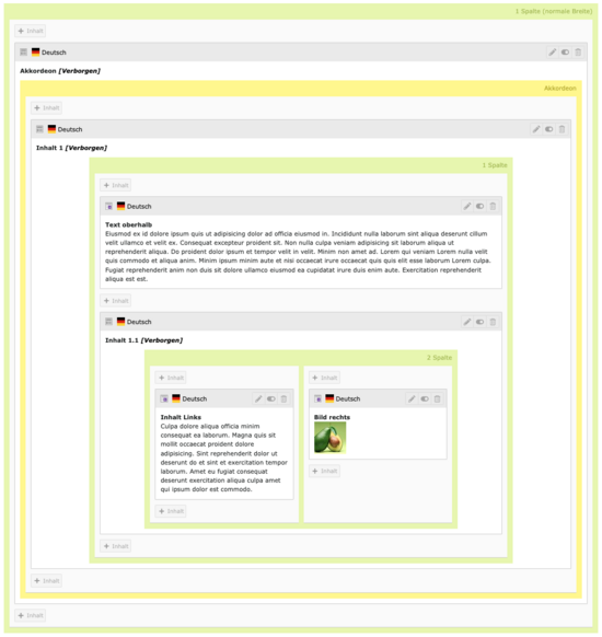
You can insert the accordion content element like any other content element simply by clicking the [+ Content] button on the page (1). The options available are essentially the same as those for a grid element.
As soon as you save, the accordion appears in the backend as a yellow grid element (2). You can only include it in single-column (narrow, normal, extra-wide) grid elements. See the next section Accordions and Grid Elements for details.
Now you can place individual content elements within the accordion (3). Almost any content element can be placed in an accordion. The exception is another accordion. Each content element in the accordion is considered as a single element. Consequently, each element is displayed individually in a fold-out manner. Grid elements allow you to create multiple content elements in one tab. This will be covered in the next section.
The heading of the accordion tab is automatically taken from the content element. The heading from the content element is visible by default. Thus, when you expand it, two identical headers appear one below the other. To prevent this, set the heading in the content element to hidden.
Accordion grid and chaining of content elements
A modified set of grid elements is available within an accordion. This allows you to place multiple content elements within an accordion group. In this way you can group multiple content elements and unfold them together, instead of automatically creating a separate accordion group for each content element.
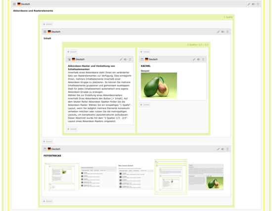
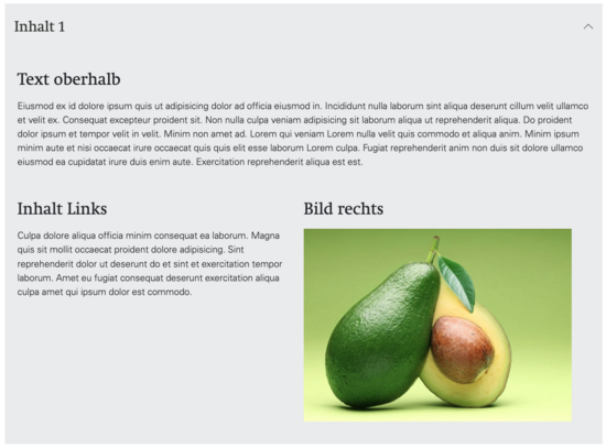
To create an accordion grid within your accordion, select the [+ Content] button. On the last tab AccordionColumns you will find the accordion grids. Choose a single column "1 Column" layout if you just want to concatenate multiple elements, or use the multi-column layouts to build more complex layout structures. This section has been implemented with the "2 columns 1/3 : 2/3" layout of an accordion grid.
Embedding an accordion in frame grid elements
The outer frame of an accordion - i.e. the entire content element - can only be included in grid elements with a single-column grid layout (narrow, normal, extra-wide). This prevents the creation of confusingly small structures. Multi-column layouts can therefore only be implemented within an accordion (using the accordion grids).
Grid elements in accordion
Single and multi-column grid elements can be inserted in an accordion. This allows content to be displayed one below the other with different columns.
To do this, create a grid element in the accordion grid with the desired column configuration. Content can now be placed in this grid element.
In the image gallery below you can see a corresponding example. The content is placed in 2 columns and the Image Gallery is embedded in the outer single column element.
You can find more examples in the gallery.
Example illustration of a multi-column accordion on a mobile device
Accordions offer a good way to make extensive content on a page more easily accessible to mobile device users. The individually expandable elements are usually collapsed (unless an anchor link is used). This allows the mobile user to grasp the content of the page more quickly. As a result, they don't have to scroll through all the content elements.
When creating accordions, keep in mind that often only a small portion of the entire page is visible on the small screens of mobile devices (especially for large accordions).
Multi-column accordion grid elements wrap like normal grid elements when displayed on mobile devices. The left column is displayed at the top and the right column at the bottom. Therefore, arrange the content elements in each column from top to bottom in a logical sequence. The spatial left/right relationships of the columns to each other cannot be displayed on mobile devices.

Using anchor links to automatically unfold accordion
With an anchor link you can jump to a specific accordion tab. This opens the tab. In principle, you proceed analogously to the creation of anchor links: When creating a link, select the corresponding content element. In the Page tab, first select the page on which the content element is (2, black arrow). Then you can select the content element in the accordion (3).
Attention: do not select the accordion. For the accordion to expand automatically, a content element in the accordion must be linked.

