Create form
This section explains what elements a form consists of and how they can be used.
Overview
Basically, three subdivisions are made. A form consists of steps, form elements and finishers.
- Step - A form consists of at least one step. Any number of steps can be added.
- Form element - Form elements can be added in each step. The form elements are the effective content of the form.
- Finisher - One or more actions that are performed after the form is completed.
- Protection against spam messages
- Quick guide - all in one
Select the Forms module to create or edit a new form. All explanations in this tutorial are performed in this module.
Overview Instructions
Create new form
Options for existing forms.
If you have selected the Forms module, the overview of all available forms will be displayed. At the top of the list there is the button that can be used to create a new form. In the list below, existing forms can be edited, duplicated and deleted. The form listed at the bottom ("Standard Contact Form") can neither be edited nor deleted, as it is provided by the system.
Create form
Select the [+] button ("Create new Form") above the list and follow the instructions in the wizard. With "Blank form" you can create a blank form. If you select "Predefined form", you can use the simple contact form as a template. After finishing, the newly created form will be opened.
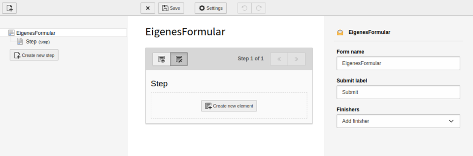
The overview of the form is divided into three columns. On the left is the overview of the steps (Step), in the middle is the detail view of the selected step and on the right is the configuration interface of the currently selected element.
While you are in the form, you can choose between Edit and Preview. This way you can view the form without having to insert it on a page.
Step
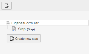
Overview steps and create new step.
A step represents sections in a form. For example, a form can be divided into Introduction, Data Entry, and Summary. However, data entry fields can also be used in each of the steps.
Steps thus have no functional aspect and are primarily for subdividing the form.
It is recommended to use data entry in only one step. This way, people filling out the form have a better overview of the data entry.
Form elements
Elements provide the content of the form. Accordingly, many options are available.
With the different elements you can now create the form according to your needs and taste. There are virtually no limits.
Since each case can be different, it is difficult to write a generally valid instruction for the use of form elements. Therefore, we recommend that you familiarize yourself with the form elements and try out different possibilities. It can also be helpful to record the form on paper (or digitally) first and then implement it in TYPO3 according to this example.
In the following accordion all form elements and their functions are listed.
| Text | Single-line text input |
| Textarea | Multi-line text input |
| Email address | Single-line text input with an email validator |
| Telephone number | Input field for a telephone number (without validator) |
| URL | Input field for an internet address e.g. https://www.google.com (with validator) |
| Number | Single line text input with a number validator |
| Date | Provides the possibility to enter a date or select it with a picker |
| Checkbox | Binary selection between "On" or "Off |
| Single select | List with selection options. Only one selection can be made. |
| Radio button | Enumeration with choices. Only one selection can be made. |
| Multi checkbox | Binary selection between "On" or "Off" for multiple entries. |
| Multi select | List with selection options. Multiple items can be selected. |
| Static text | Provides the possibility to place an explanatory text on the form. |
| Content element | Allows any content element from easyWeb standard to be included in the form. |
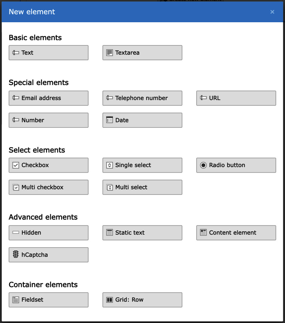

Figure 1

Figure 2
Custom error message
You can now configure the error messages that are displayed when a form is not filled out completely.
To do this, select your form and a step in the Forms module. There you can configure the "Custom error message". If the field is left empty, the message "This field is required" will appear. (See Fig. 1)
You may need to adjust the settings in the content element where the form is embedded. To display your Custom Error Message, select the "Override Finisher Settings" field in the "Plug-In" tab. (See Fig. 2)
Finisher
A finisher action is executed when the website visitor clicks the "Submit" button of the form. There are 5 finisher actions to choose from. Forms can also be used without a finisher. However, then you have no possibility to access the entered data of the visitor. Therefore it makes sense to select at least the "Email to receiver (you)" action. If a finisher action has settings that require an entry, it will be colored red and saving will not be possible until all required settings have been made.
Set Finisher by selecting the top element (with the form name) in the overview on the left. The form options with the finishers now appear on the right.
| Finisher | Description |
|---|---|
| Email to sender (form submitter) | Sends an email with the data of the filled form for confirmation to the address of the person who filled in the form. However, the email address must be known for this purpose. So if you want to use this action, you must provide a field in your form that lets the visitor enter his email address. |
| Email to receiver (you) | Sends an email with the data of the filled form to a fixed specified address (e.g. yours). |
| Redirect to a page | Redirects the visitor to any page on your easyWeb standard instance (e.g. the start page). |
| Confirmation message | After the form has been submitted, it is normally hidden and no longer displayed. With this finisher you can display a text (e.g. "We have received your request") on the page after submission. |
| Save Form to Database | Saves the entered data to the database. The data can later be downloaded manually as an Excel file. Instructions on how to export form data can be found here. |
Attention: If the "Redirect to a page" finisher is used, it must always be inserted at the very end of all finishers. Otherwise undesired behavior may occur when submitting the form. The order of the finishers can be easily changed by drag&drop at the end.
Configure finisher
Depending on the selected finisher, different configuration options are available. When creating finishers, you will be prompted to configure them. These apply globally to the form. When inserting them into a page, however, they can be overwritten locally.
For certain finishers, a dependency on the fields in the form can be defined. From all input fields of the modules the value can be inserted into the corresponding finisher field. The values are automatically applied when the form is submitted. It is recommended to take the appropriate matching field - e.g. for the field "Email Address" use an Email module. This is explained further in the following section.
The list describes for each finisher which fields are required:
| Finisher | Required |
|---|---|
| Email to sender (form submitter) |
|
| Email to receiver (you) |
|
| Redirect to a page |
|
Confirmation message |
|
| Save Form to Database |
|
Filling a finisher automatically
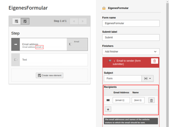
You can feed values from the form directly into Finishers. Thus, for example, names or email addresses can be used directly.
Each element receives a unique ID, which can be found when hovering over the chosen element. By default, this is the type of the element with a consecutive number (e.g. "email-1"). If you now ask the visitor for an email address, you can take the ID of the field and specify it as the finisher email. The same is true for names.
On the use of variables in email fields: To avoid typos, we recommend you use the input help at "Subject" (The plus symbol on the right in brackets, see second photo) and then copy&paste it into the desired email field (email address or name). This way you can make sure that your form works without errors.
The pictures show the example when the person who fills in the form should receive an email after submitting the form.

Protection against spam messages

A hCaptcha for spam protection
The easyWeb standard form is protected against spam by various means. On the one hand, a honeypot is used and on the other hand, a captcha can be inserted into the form for confirmation.
A honeypot is a device that lures attackers (e.g. bots) to a wrong target. Thus, automated messages can be prevented. However, breaches can occur despite honeypots. That is why we always recommend to include a captcha.
Captcha
Captchas are simple image association puzzles, but they cannot be easily solved by bots and represent a major time hurdle for spammers. We therefore recommend that you provide all forms you create with a captcha. In easyWeb standard, captchas are built in as a form element.
To add captcha protection to your form, select the"hCaptcha" element from the available elements. Normally, this element is placed at the very end of the form. That's all you need to do.
The visitor to your website will now have to solve an image puzzle, as shown in the second figure, before submitting the form.
All in one
Complete instructions in a series of pictures. Below each image you will find a short text explaining the step.
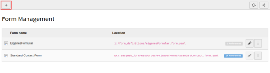
1: Create new form - First, you have to create a new empty form. To do this, call up the Forms module with a click from the module menu. After that, a list with the already existing forms of your easyWeb instance will be displayed. Now click on the "+" symbol.
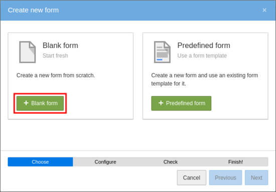
2: Follow the wizard - The "Create new form" wizard appears. Enter the title of the form in the "Form name" field. This is only visible in the backend. Make sure that "Advanced Settings" is not checked and click "Next". Click "Next" again when "Step 3 of 4" is displayed.

3: Switch to the editor - The overview of the form is now displayed. The form editor is divided into 3 columns: Left - Add/Remove/Modify Steps, Center - Elements of the selected step, Right - Edit Properties of the selected step/elements.


5: Insert elements - Click on the "Create new element" button to add an element to the selected step. The available elements can be found in Figure 5 or in the table above.
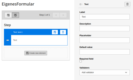
6: Edit properties - the element is inserted and automatically selected so that in the right part of the editor the properties of the element can be edited directly. The elements usually have the following settings: Label, Description, Placeholder, Default Value, Required Field and Validators.

7: Select appropriate finisher for the form. Finisher can be defined only when the top element in the page tree - the form - is selected. There are five different finishers: Email to sender (form submitter), Email to receiver (you), Redirect to a page, Confirmation message and Save Form to Database.


